Search
Close this search box.

Guy's Blog

Guy frequently keeps this blog updated with thoughts, challenges, interviews and more!

Tag: engraved prints

Yesterday, I gave the impression that I had found an authentic medieval Italian falchion treatise. But actually it was the work of Heidi Zimmerman (the Meyer plates printing genius), an anonymous calligrapher friend, and yours truly. I got the idea long ago, and while talking to Heidi over skype one day, asked her in on the jape. My contribution was to design the system: I chose the guards, the techniques, and so on, and I wrote the “medieval Italian” verses. Which are largely stolen from Fiore and Vadi.  I framed the images I wanted in the salle, with Ville Henell and Ilpo Luhtala, and took photos, which Heidi drew and painted. Then the calligraphy was added, and our treatise was made real. I also roped some friends in to boost the signal; not everyone who appeared to believe did so! Thanks Neal, Mike, and all the usual suspects.

But lest you think I am a lying toad, not so! Every word of the revelation yesterday was true. Let me explain, by adding in the missing information.

“Previously unknown Falchion treatise” is true. It is a treatise. About the falchion. Unknown to almost everyone. And I discovered it in my shared Dropbox folder.

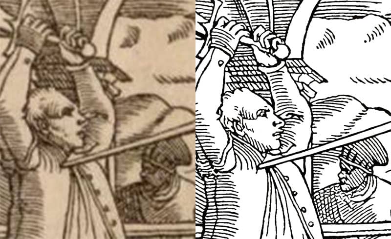
As you may be aware, I have spent most of this year in Italy, [TRUE] and much of that time looking for insight into the systems I teach. [TRUE up to a point] While I was there, I found a treatise [in my dropbox folder]; probably in the Fiore/Vadi tradition. [Well, it is!] It features two women, exemplifying the art of arms as applied to the falchion (or messer, or storta). The original is in private hands: fortunately, the owner is a reader of my books, so agreed to let me post them. [Yes, Heidi does read my books.]

Every word of what followed was true. But my glee was caused by mischief-making, not by finding an original treatise…

But seriously, folks; if we ever do find a medieval Italian falchion treatise, I think it will look like this. These actions can all be found in, for instance, Lecküchner's treatise, and in Italian sources for the longsword. The structure is very Fiorean, and follows the logic of his sword in one hand plays. The number of guards, numbers of techniques, and so on, are all very much in the model Fiore set.

I should also point out that we were very careful to make it just “wrong” enough that it could not be passed off as a forgery. My overriding brief to Heidi was that if the original is found in a hundred years, nobody in the medievalist world could reasonably mistake it for an authentic medieval document. Well done all of you that spotted the many “errors”. Most obviously, that great big falchion at the end is indeed a picture of Cosimo de' Medici‘s falchion from the Wallace Collection. From about a century after this is supposed to have been written. That was meant as a little clue….

Anyway, I hope you all had fun with this (though it's obvious from some of the internet chatter that some folk were really annoyed, which I find baffling). I have been thinking a lot about stortas (Italian falchions), and how odd it is that we have lots of surviving originals, and lots of German sources for the equivalent messer, but nothing in Italian. So this is an exercise in predictive archeology: if such a treatise ever does come to light, I think it would look like this. I'm planning to write up a proper analysis of the “system”, with translations of the verses, and why I think it would look like this, but I'm in the process of moving back to Finland right now, so it will have to wait.

I raise a glass to tomfoolery, and to Heidi! For more of her art, go see Draupnir Press.

For the first time since starting this blog, I have invited a guest post. This comes from Adelheid Zimmerman, whom I got to know at WMAW last year, and who has come up with a wonderful project which she has successfully crowd-funded. In short, she is producing very high quality copper plate engraved prints of the longsword plates from Meyer's mighty treatise of 1575.

I hope you find old-school printing and the production of books as interesting as I do, and will support her campaign!

Here's Adelheid:

I have taken on a project to restore and reproduce the illustrations from Joachim Meyer's A Foundational Description of the Art of Fencing. There are two reasons that I find this project fascinating. I love that I am putting into the hands of historical european martial artists the images that the masters taught from in the form that they were intended. On a more personal level, I enjoy the artistic investigation of the restoration and visceral pleasure of producing that art in a historical manner.

When Joachim Meyer needed illustrations for his book, he commissioned the workshop of Tobias Stimmer. Meyer likely provided models and oversaw the drafting process, providing input as to the fighters' positions as well as contents of the backgrounds. Stimmer and his draftsman observed not only fighters training but also the interests and influences of the fencing school. It is impossible to know how much of the actual drafting was done by Stimmer and how much was done by an apprentice in his workshop trained to work in his style.

When a final draft was approved, it was transferred to wood and carved by a highly skilled tradesman who would then remove the negative space from a specially prepared block of hardwood. These engravings and a manuscript of the text were taken to the printer Thiebolt Berger of Strasbourg

who then laid out the lead type and woodblocks which were then printed onto pages that could be folded into signatures.

Printing in Meyer's day.

The printing process degrades the woodblock, making each successive print of slightly reduced quality. Woodcuts were generally not kept by printers. Successive editions were commissioned by Meyer's widow. While it is possible that Meyer himself kept the woodcuts, it is just as likely that each successive edition was recarved.

The making of these modern day reproductions happens in a slightly different manner from the originals 400 years ago. Instead of beginning with an artist/draftsman, I am beginning with a photograph of the original print.

For most of the reproduction work that I have done in the past, I would proceed in the manner of the Renaissance art student. I would use the same materials as the original artist and paint the piece over and over until my work was indistinguishable from the original. Doing this with the watercolors of JRR Tolkien has long been a way for me to deal with stress in my life. However, this project requires a digital approach.

For each illustration, I open the photograph into photoshop, artificially enlarge it to give myself room to work, remove all of the color information, remove anything that was paper, and make an initial pass at smoothing out the variances in line caused by both the enlargement algorithm and inconsistent application of ink in the original. Thus I have prepared my canvas and can begin the real work.

The rest of the process is spent zooming in and out. In to look at how the pixels stack and back out when I get lost in the maze of tiny squares. First I tidy up the border and remove artifacts. Next, I adjust for a curve or wrinkle in the paper. For the process of cleaning up the detail of the image, I am constantly mindful to hide my own hand and keep to the style of Stimmer. I call upon my knowledge of how the thick, sticky ink of a letterpress coats an image so fine and how the pressure and absorbency of the paper pulls it off. Using the brush and eraser tools, I fill in where a line must have been drawn and erase where a carving knife must have removed the wood of the block. My block, my ink, my paper, and my press are all slightly different than the originals. I make a few choices in line weight to compensate for these differences.

The original scans look like the one on the left; I clean them up to look like the one on the right.

When my digital files are ready, I send them off to an engraver. Unlike the woodcarver who made the originals, I utilize a die manufacturer well known for their high quality service as well as environmentally and socially responsible practices. They take my digital file and use it to carve the drawing out of copper with a CNC. They then have a trained engraver go back over the image with fine tools to make sure that it is perfect before sending it to me.

When I get the copper plate from the engraver, I lock it up in my letterpress, ink the plate, and press the paper. The printing process sounds simple, but is a matter of technique and finesse. The press needs to be adjusted for each print run depending on the thickness of the plate and the paper. Even incredibly small variances in the pressure of the plate against paper make huge differences in the quality of the print. After each print the thickness of the ink application changes slightly. Even the slightest shift in the paper can produce a visible shifts in the registration.

Once the prints are pulled and the ink has dried, I go back over them and discard any that are not of a sufficiently high quality. With simpler designs, this usually results in a 10% loss. The high level of detail in these illustrations means that over half of of the prints are discarded. The remaining prints are sorted in order of quality, then labeled and numbered. If a print run produces 50 quality prints, the one of highest quality is labeled 1/50. In pencil in a location that can be hidden upon framing, I note what the image is, the name of my press, and the print's number.

This is the largest reproduction project that I have taken on to date. I have been highly encouraged by the public response that I have received, and I am looking forward to working on more projects like this.

Guy again: so, chaps, wallets out and go buy some fab artwork: you know you want to!

Search

Recent Posts

Ready to Wrestle?

I’m delighted to let you know that From Medieval Manuscript to Modern Practice: the Wrestling

¡Viva la Panóplia!

I’m just back from the Panóplia Iberica, held in Alconchel, a village in Spain near

Categories

Categories

Tags